Art Direction, Advertising, UI & UX Design
Postal Pals
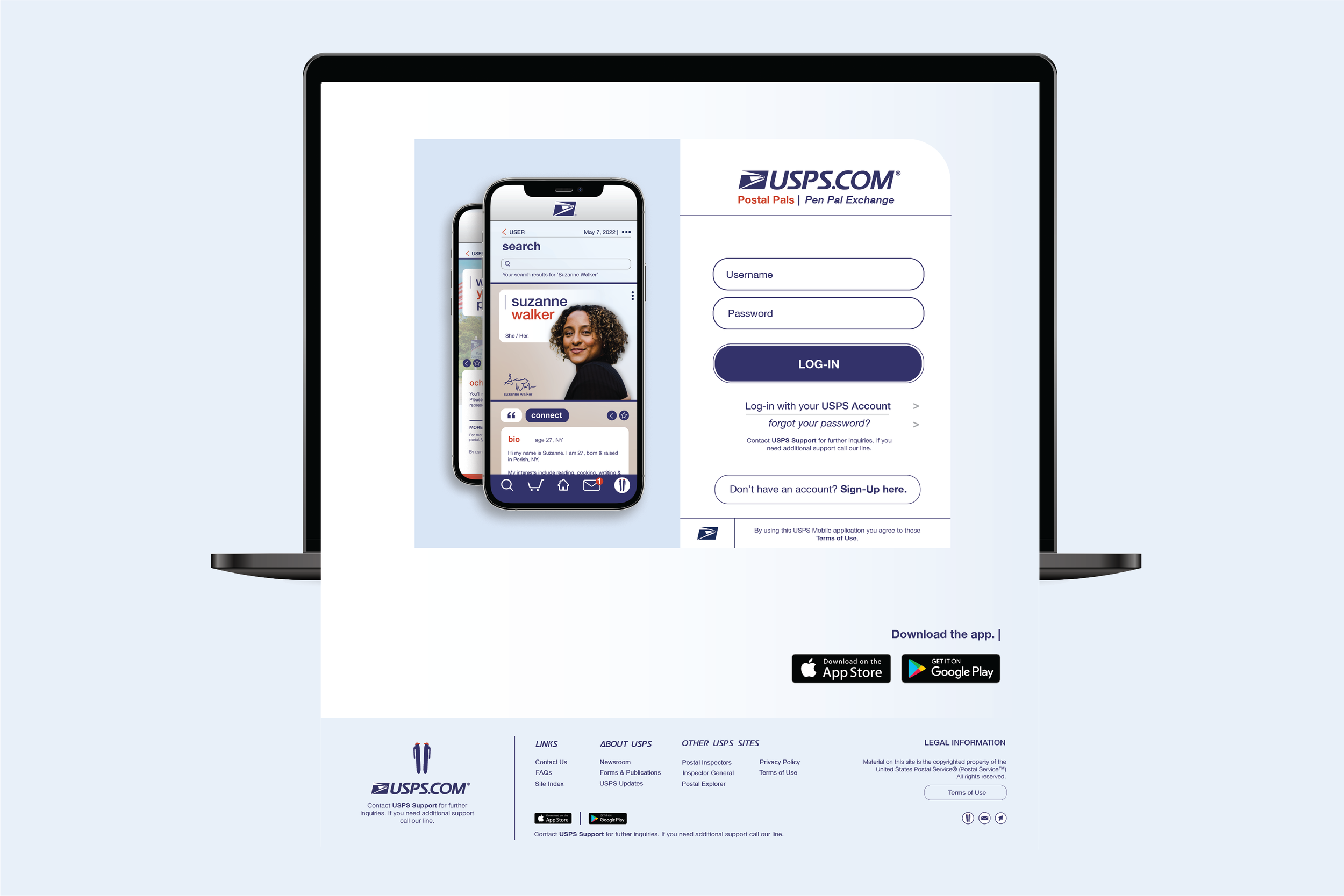
USPS’s new pen paling app welcomes users to create lasting friendships through the national postage system.

Friendly, Encouraging, Reliable, & Integral.
Voice & Identity
Over the last fifteen years, USPS—a pillar of transportation and community connection—has been finding increasing difficulty in maintaining its status as a self-funding agency, a status necessary for its survival. This bedrock agency of the American system stretches through history back to the inception of the nation and is charged with connecting communities, whether there be snow, rain, or __ obstacle in the way; now, revenue and a lack of service usage are what block the path of promised delivery.
Pen paling has been used as a mechanism to create lasting friendships, build literacy skills, and engage with the mailing system. By implementing a domestic community outreach program with USPS in the form of pen pals, we create a lasting friendship between each worker in the postal community, the letter we entrust them to deliver, and the citizen at home.


The Market
USPS’s Target Audience
Building off a recognized brand with an established style guide, Postal Pals needed to maintain USPS’ brand integrity while simultaneously creating an energizing look to both attract new customers and remain recognizable to brand-loyal users.
By implementing a UX-based pen pal service, the platform not only encourages users to correspond and connect but also to entrust USPS with delivering their messages of friendship.

A New Look
Design Strategy
Services: Art Direction, Brand Identity, UX & UI Design
Visually, Postal Pals remains true to USPS’s brand identity while also adding variations to extend the concept and create a refreshing voice. By introducing soft blues and varying gradients, we follow the brand’s original color palette but extend an uplifting atmosphere. Additionally, we use visual elements from stamps, packages, and USPS stickers to reinforce the language of our mailing system.


